
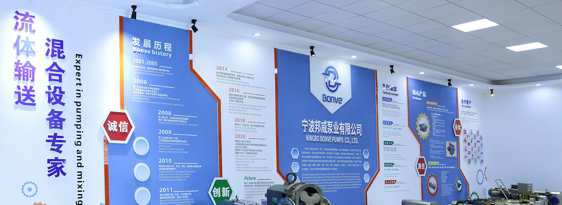


Blue:The main body of the logo is in blue, which usually gives people the impression of professionalism, reliability and technology, conveying the company's professionalism and trustworthiness in the pump industry.
Yellow:The letter “B” has a yellow water droplet element within it. The yellow color is more eye-catching and symbolizes vitality and efficiency, while the water droplet also makes it clear that the company is associated with liquid transfer (pump industry).
Alphabet Modeling:The whole is an artistic letter “B”, which is the initial of “Bonve” and has a strong brand identity. The shape of the letter “B” incorporates the element of piping, reflecting the close connection between the pump industry and fluid transfer piping systems.
Teardrop Shape:The yellow part within the letter “B” is in the shape of a water droplet, visually indicating that the product is related to liquids and highlighting the industry attributes of the pump industry.
The logo demonstrates the professional and reliable brand image through the blue color, highlights the industry attributes by using yellow water drops, and combines the artistic letter “B” and piping elements to not only strengthen the brand recognition, but also reflect the function and role of the pump industry's products in the fluid transportation system, the overall simplicity and full of connotation, which effectively conveys the brand positioning and business characteristics of Bonve The overall simplicity and connotation effectively convey the brand positioning and business characteristics of Bonve.